UX Case Study – Voice Assisted Cooking app
This is a comprehensive article summarising a collaborative project for a Voice Assisted Cooking app which I did together with my colleagues during our MSc UX Engineering at Goldsmiths, University of London. This is a somewhat condensed version of the project, as I chose to leave out some of the more academic parts. With that being said, why voice assisted cooking?
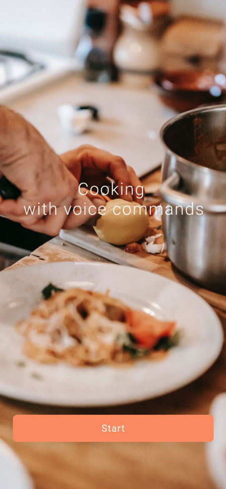

Well, cooking is a common activity in most households. Cooking is not only a necessity, but a pleasure and a hobby that many people take up. However, the interaction between technology and the cooking process is not always smooth. To ease that interaction, we proposed a cooking app with a voice assistant to aid in the kitchen when we are most busy. The goal of including a voice user interface (VUI) is to help users remotely operate devices (such as a phone) whilst cooking. Users could use either the voice assistant or the phone to see recipes, ingredients, steps and technical videos to let the user focus on the cooking, and not on how to touch the phone without dirtying it.
Demographic and Some Literature
Doing a deep dive into the literature reviewed for this article would prolong it unnecessarily so in the interest of simplicity I'll include the main takeaways.
- We reviewed literature that supports Conversational Experiences (see Pearl, 2016). These sources contained detailed guidance for designing and implementing VUIs.
- We established our demographic as young adults who are interested in cooking or learning how to cook
- People care about the cost of their smart voice assisted devices and that is a deciding factor in whether they would like to purchase them or not. With that, low margins and production costs would be something to keep in mind.
Design Plan and Process
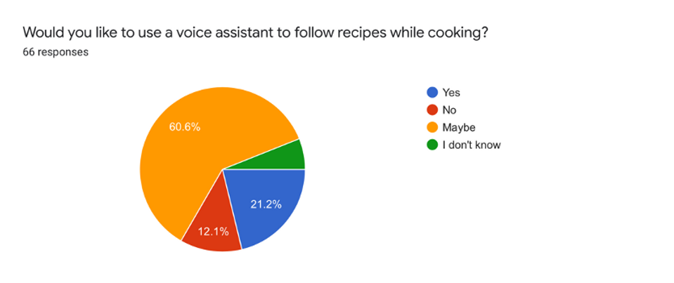
Based on the key issues listed and the user needs from our previous research, we proposed our design goal: to help the target users safely and quickly make dishes that they have never cooked before/are not familiar with, through the voice interaction and other interfaces, improve the experience of the whole cooking process.
1. The user touches the screen as little as possible;
2. The communication between the user and the voice interface should be consistent with the environment in the kitchen;
3. The product can accurately convey information.
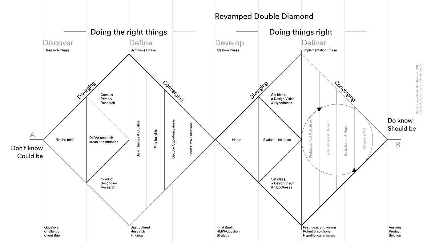
We used a double-diamond principle to determine the main tasks in our design process, putting our planned tasks in the corresponding stage in the diagram. In the Discovery stage, we conducted academic research, initial interview, persona creation and competitive product analysis. In the Define problem stage, we have made the user journey map and business model canvas, then we would like to do some further user research and some sketches. In the Develop design idea and Deliver solution design stages, we want to define the user scenarios and personas, as well as make the lo-fi prototypes through ongoing testing and iterative cycles.
Primary Research
After our initial literature review, we decided to do a survey to gather information about people’s opinions on cooking in general and cooking aided by a voice assistant. We designed the survey to include a total of eleven (11) questions, with the last question reserved for further information. The aim of the survey was to gather general information about our potential users and their attitudes and capabilities in relation to cooking and technology.
Results
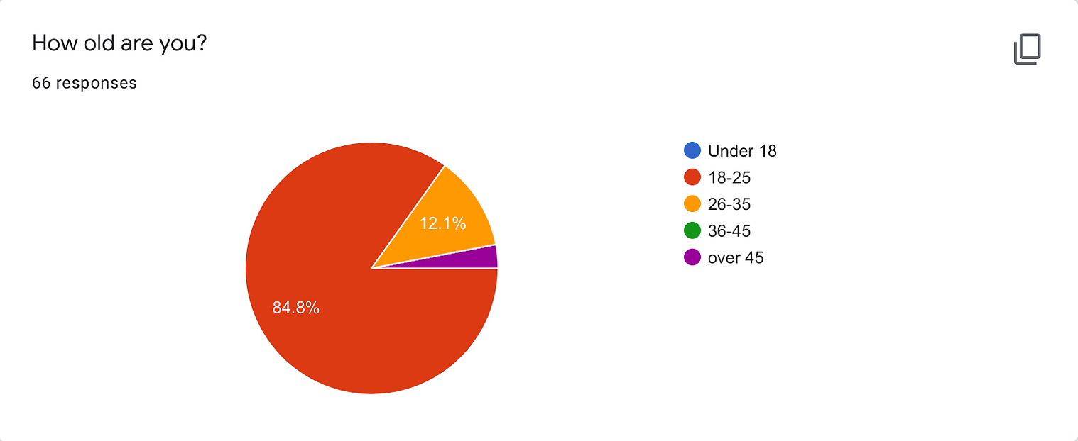
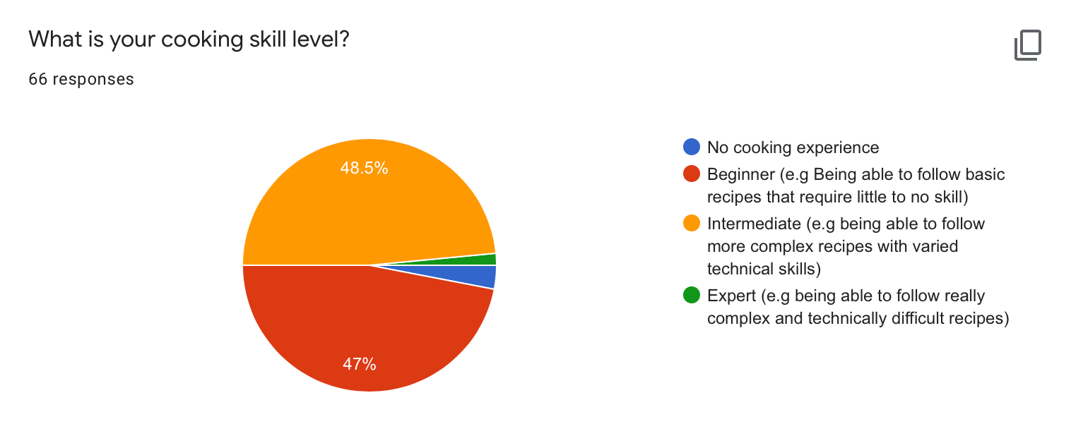
We received a total of sixty-six (66) responses. From those, the majority (84.8%) were in the age range of 18-25 years old, followed by 14% over 25 years old. In terms of cooking skill level, there was an almost even split between beginner level (being able to follow basic recipes with little to no skill) and intermediate level (more complex recipes with varied technical skills). This gives us insight into the kind of recipes that should be included in the app, as well as the kind of technical videos we might need to provide.
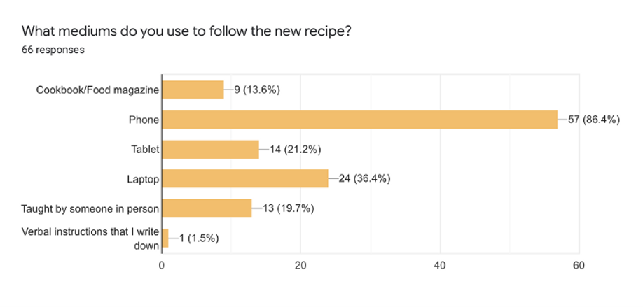
When asked about the frequency of cooking, most people cook at least a couple of times a week and try a new recipe a few times per month. When it comes to finding and following recipes, the trend shows that users like to find recipes on speciality websites or in cookbooks, alongside social platforms and recipes recommended by friends. Most prefer a technological medium to follow the recipe (phone, tablet or laptop), some like physical books with instructions or being taught in person by friends. If provided with a digital medium, 80% of our respondents chose to watch or listen to video tutorials if they are offered by the platform.
Personas and User Journeys
Narrowing more into the ‘define’ stage of the design process, we interpreted the results provided by the research and moved on to composing user personas and a potential user journey. I will firstly discuss the user personas and the considerations we took into account. The main distinction between the two personas is their cooking skill level, so we came up with Johnny and Jane.
Johnny
• 21 years old, an undergraduate student in London who loves video games and playing the guitar;
• Has little to no time to cook, but enjoys the process and always wants to learn something new – driven by curiosity, he often finds new recipes on his phone or laptop;
• He considers himself a beginner cooking wise, but is motivated to learn something new in order to have his friends over for dinner;
• He does not use voice assistants almost at all;
• Some of the pain points he encounters while cooking are dirty hands when trying to check the recipe, suddenly realising he is missing an ingredient, and being able to juggle multiple tasks to be more efficient.
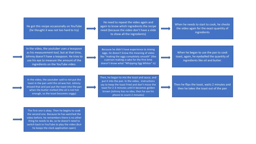
This is the user journey associated with Johnny. He tried a french toast recipe for the first time from a YouTube video he saw recently.
Jane
• 24 years old, a financial consultant for a company in London who loves cooking, gardening and yoga;
• She cooks almost every day and also enjoying trying out new recipes, which she finds and follows on her phone;
• She is at intermediate skill level, but wants to be more creative in the kitchen;
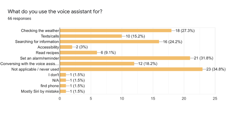
• Uses voice assistants to check weather, make calls or play music.
This is the user journey associated with Jane.

Information Architecture
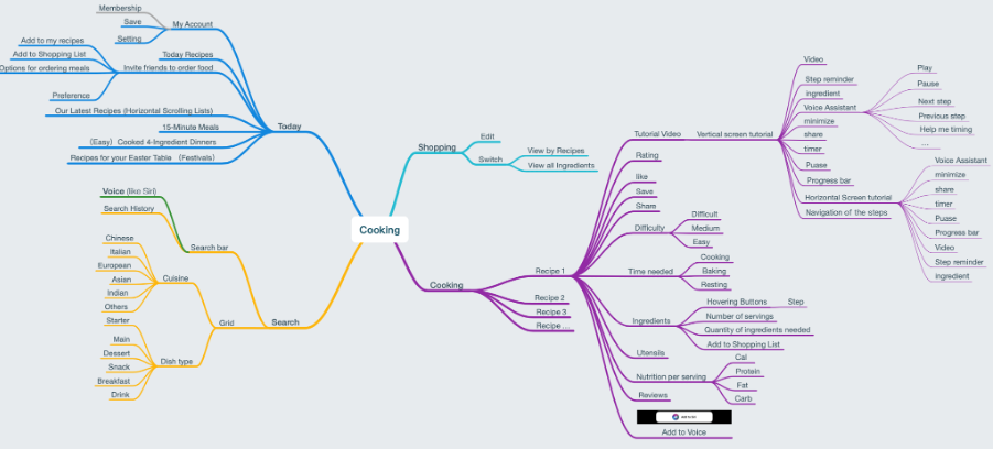
During the user research phase we distilled some requirements, including not knowing what to eat, having no cooking experience, needing to manage their own ingredients, needing an assistant when cooking, needing timed and accurate cooking, etc. We designed four important functions based on these important requirements.
- Today: Solve the needs of users who don't know what to eat and provide them with better inspiration
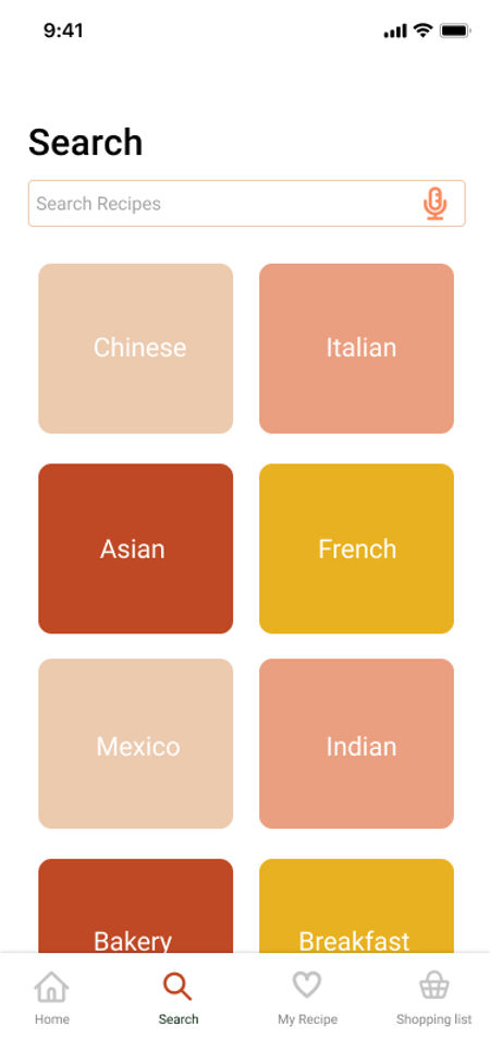
- Search: improve the search, voice search to help users quickly search for dishes to be made
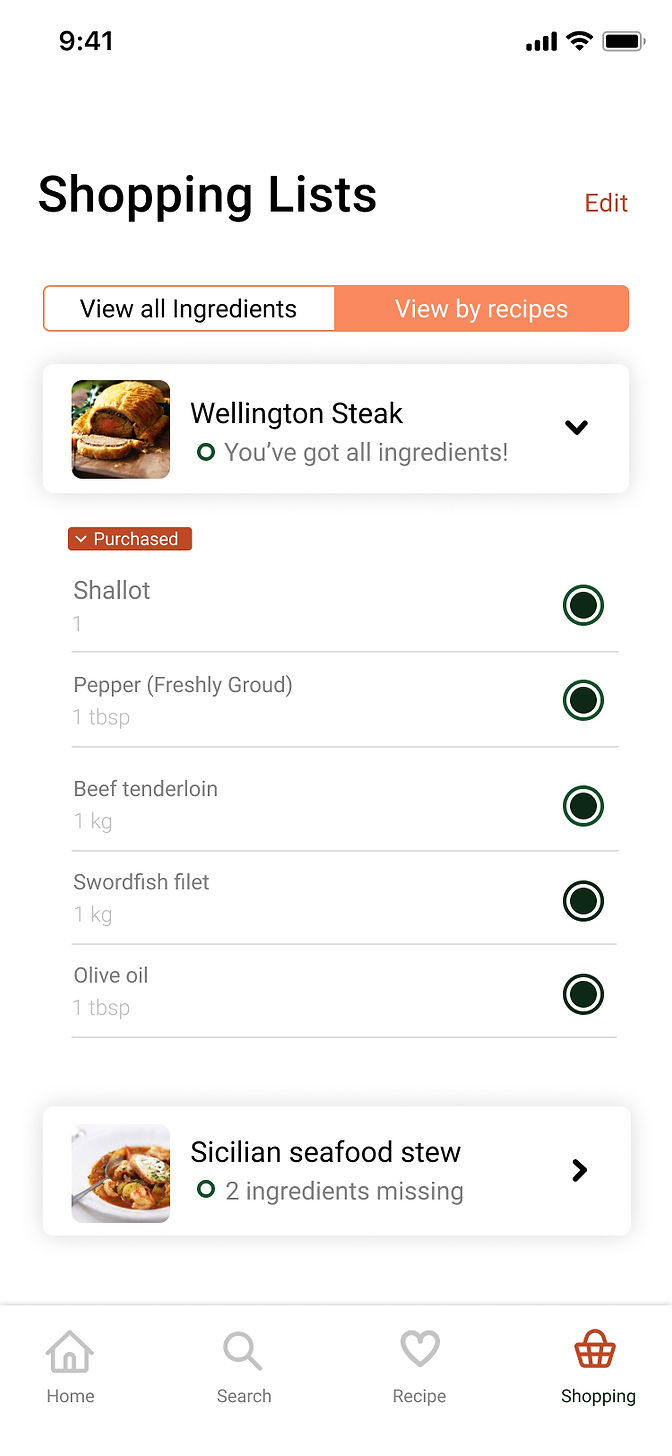
- Shopping list: help users to achieve ingredient management and organize shopping lists
- Cooking: help users cook better by combining voice and finger tapping, including providing them with functions such as timing, minimizing the window and making another dish.
Lo-fi and Hi-fi Prototype
The low-fidelity prototype is divided into four main functions, presented in the tab bar as Home, Search, My Recipe and Shopping list.
The Home page intends to help users who do not know or cannot decide what to eat. Therefore, the Today Recipes part accounts for the largest proportion, where users get recommendations, thus reducing the user's choice cost. According to Personas, the main users are positioned as cooking novices, so the second major section is Easy Meal, with 15-minute meal, 3-ingredient meal, 5 steps meal and other entrances. In addition, there are sections such as Latest Recipes and What to cook this week.
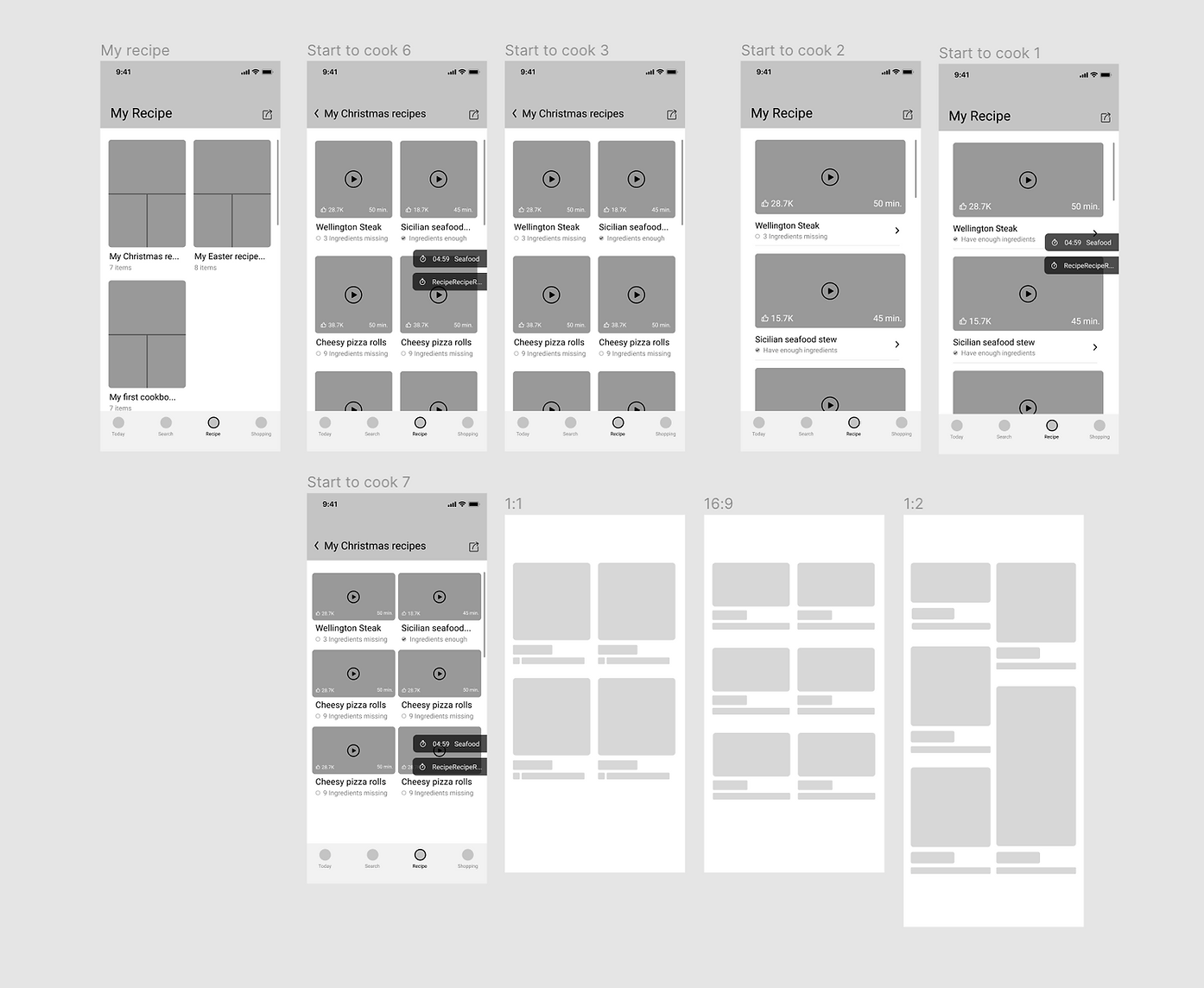
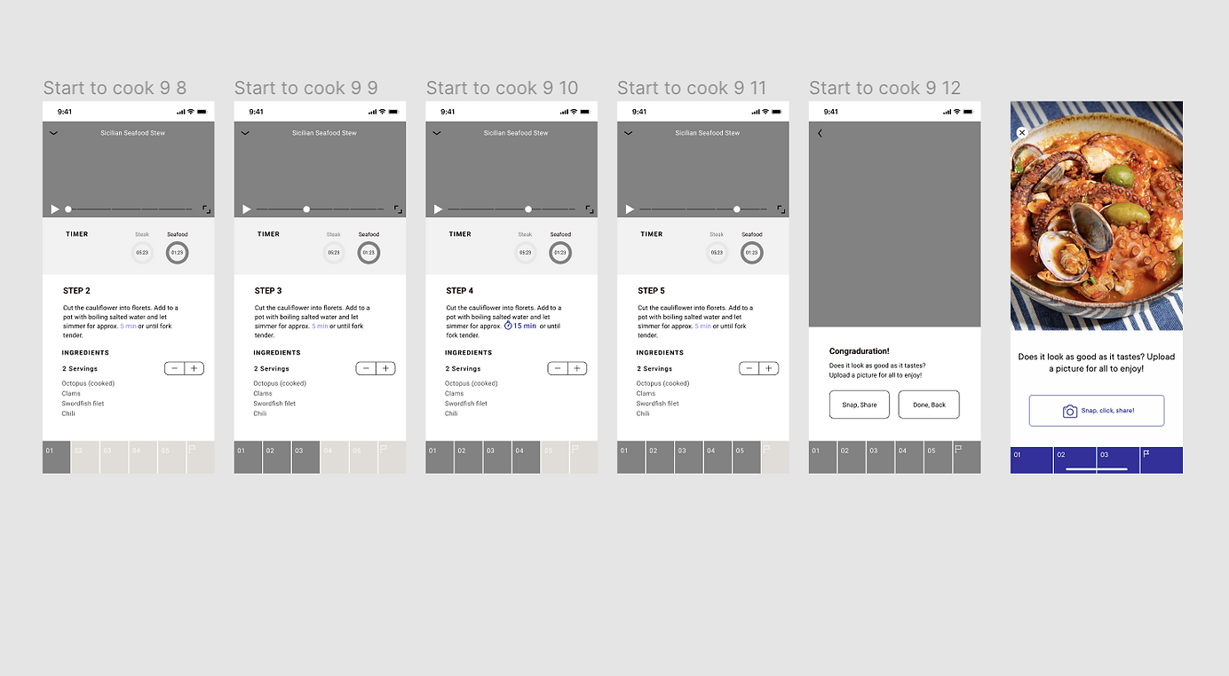
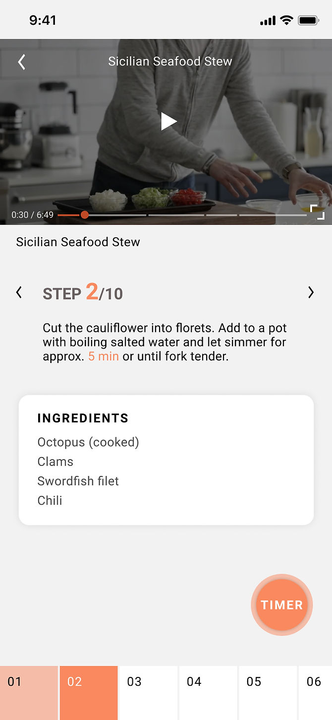
The recipe details page could be accessed by above two ways. On the details page, The user can view the required time, materials, difficulty and other information, they can click to enter the video tutorial, and can also do operations of like, favorite, share ,etc. The favorite recipes will be displayed in the My recipe section. Enter the video tutorial on the recipe details page. Taking into account the needs of different user groups, the tutorial page can be freely switched between horizontal and vertical screens. The user can see the tutorial page in portrait orientation first.
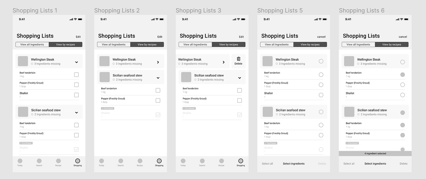
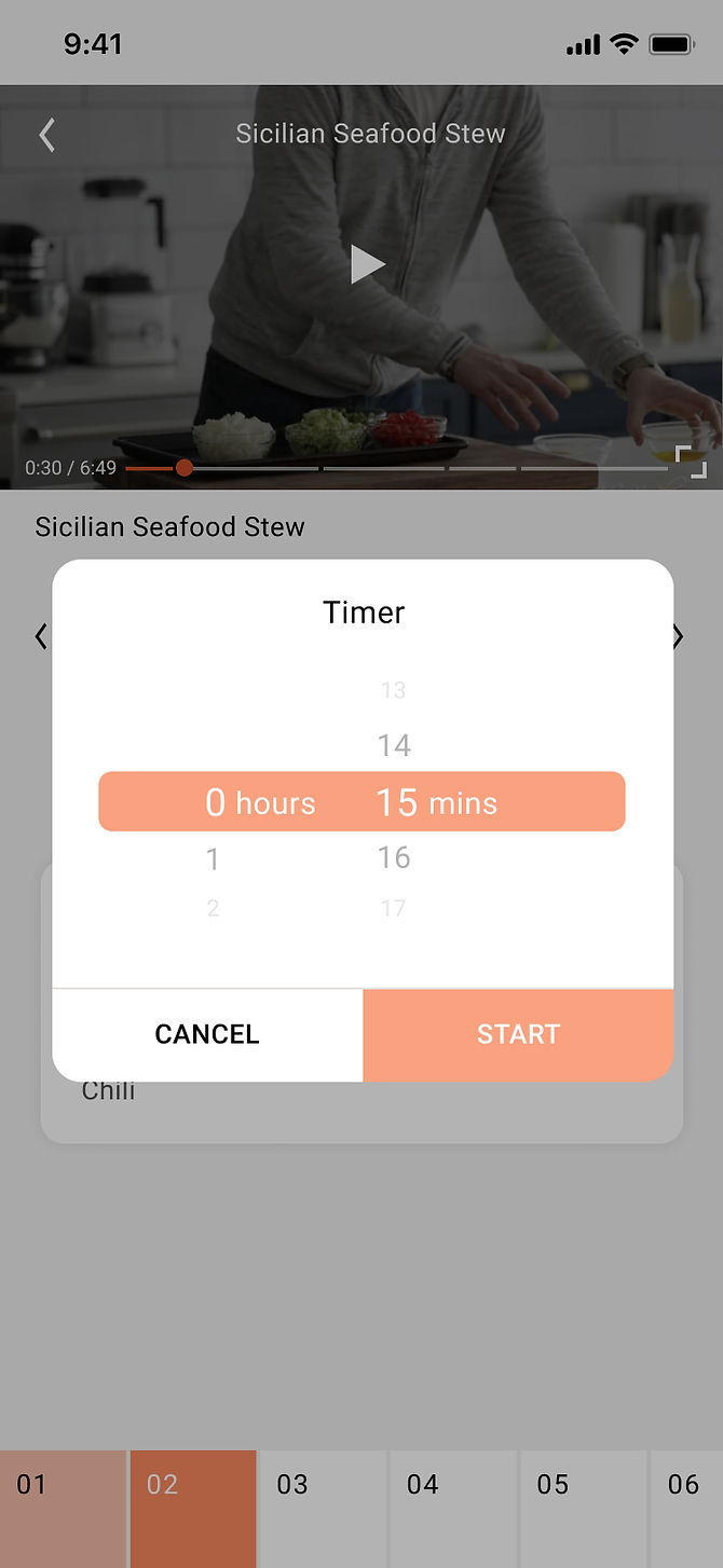
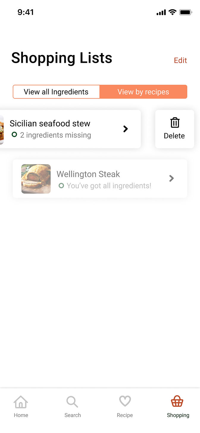
At the bottom of the page, it can be switched between different steps, view the description of different steps and the required ingredients. When the users need to time the meal during the cooking process, they can click to select the time duration. Switch to the horizontal screen page, the function is similar to the vertical screen. Return to the details page in the timing state, the tutorial will be minimized to the screen, and the remaining time of the timing will be displayed. Up to two recipes can be timed at the same time. The last functional partition is ‘Shopping list’. On the recipe details page, the required ingredients can be added to the shopping list to record what to buy. In Shopping list the users can choose to view all the ingredients they want to buy, or view it by recipes. Click the small box to check the ingredients and store it in the Purchased block. In addition, click Edit in the upper right corner to delete items in the list in batches.
In the high-fidelity prototype, we made some adjustments after some development and evaluation tests.
• We chose orange as the theme colour, and mainly used rounded-corners cards to display the content.
• The homepage will remind users to use the voice interaction function, emphasising the main feature of the application.
• In the video tutorial page, the timer function becomes a floating button that can be dragged, which can then be clicked for timing.
In the timing state, the remaining time will be displayed, and the details of the timing will be displayed when the floating button is expanded (the name of the recipe, pause and stop functions). When returning the page in the timing state, the floating button will be displayed on other pages and the number of timings will be displayed. It can hold two timings at most. After unfolding, the user can quickly enter the corresponding recipe page, or turn off the timer.

Tree test
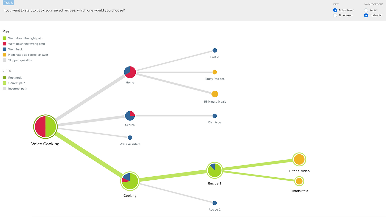
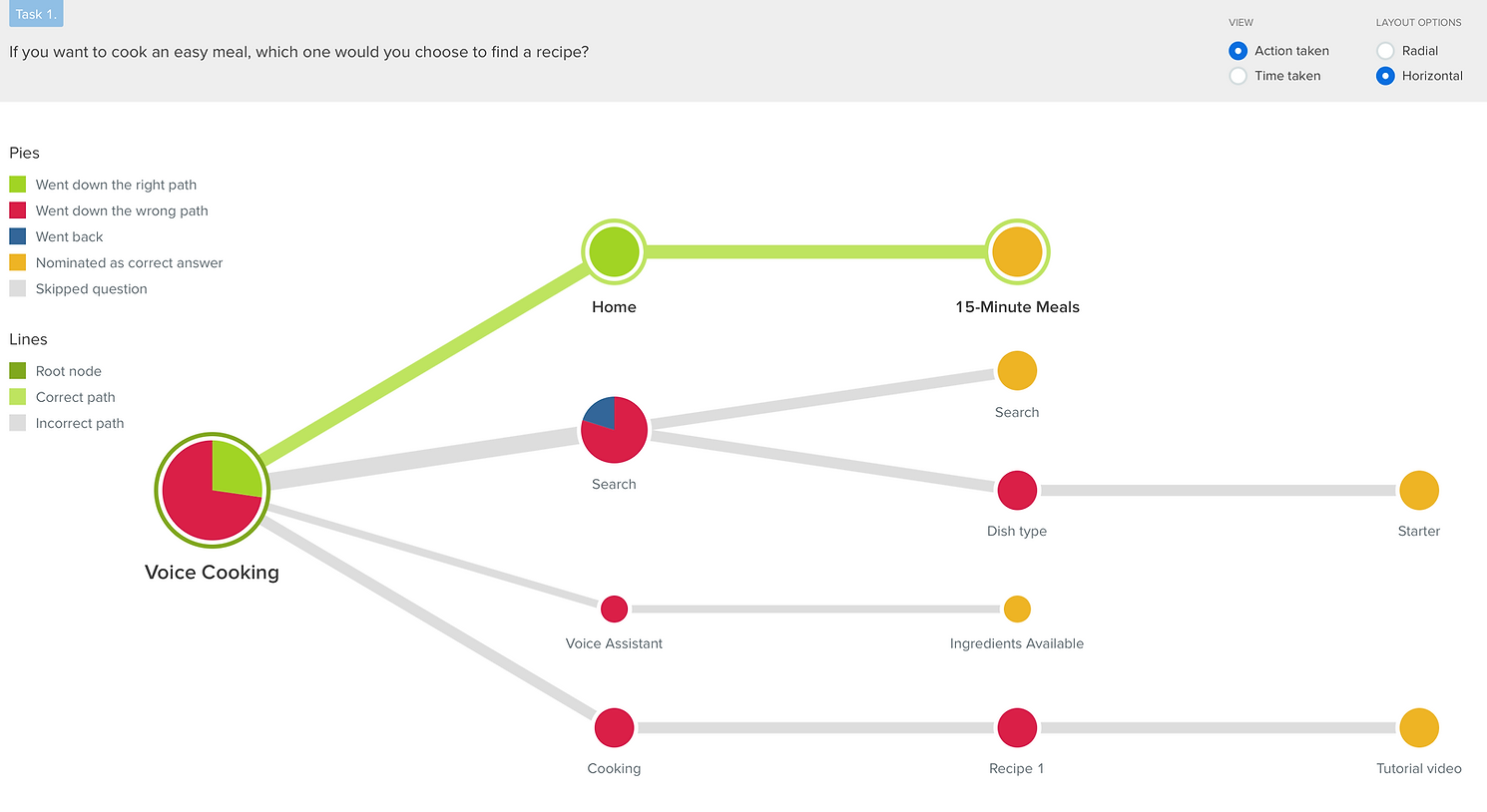
We first did a tree test for our information architecture. After we quickly sketched out the main pages, we followed up with more pages to serve the different functions of the prototype. We wanted to evaluate the information architecture early in the process because on it depended the rest of our organisational structure. The questions were designed to gather information about the paths users took to reach both main and alternative pages. The four questions we defined were:
-
If you want to cook an easy meal, which one would you choose to find a recipe?
-
If you want to make Sushi, which one would you choose?
-
If you want to check all the ingredients you need to buy, which one would you choose?
-
If you want to start to cook your saved recipes, which one would you choose?
Three of the questions had up to two possible correct paths. The goal of this task was to evaluate the structure and wording of our information architecture.
First click test
The tree test was followed by a first click test on a lo-fi prototype of the application. Based on the feedback received on the tree test, we re-evaluated the information architecture and went on to design a low fidelity prototype of the main functions of the application. This too we tested early on to ensure we could move forward with a higher-fidelity prototype. The goal of this test was to evaluate how users feel about the functions of the prototype when faced with a visual representation of the app.
We asked participants to click where they thought they would find the answer to the questions we posed. To account for accidental clicking near the correct area, the surface for correct clicking was quite big. Where multiple widgets would lead to correct answers, all correct areas were accounted for.
Usability Testing
We planed to invite 3 target users to run the prototype on a mobile phone (iPhone 10) to test it in an actual cooking situation. The tasks to be tested are:
-
The number of times the user touches the screen (compared with the same task without our product);
-
The time it takes the user to complete a new dish through the prototype test;
-
Rate of voice support to correctly understand and execute user commands;
-
Whether the user knows when to speak and what to say to the voice guide (test at several points in the flow).
Evaluation Results
The evaluation of the information architecture provided us with insight into possible problems with the structure and wording of our app. Each question was faced with problems in terms of finding the correct pathway. For example, the question “If you want to start to cook your saved recipes, which would you choose?” had a 50% rate to the correct path. Half of the participants went for options that, although not entirely wrong, did reflect the lack of clarity on the terms we used to define the pages, as well the phrasing of the question.
Similarly, for the question “If you want to cook an easy meal, which one would you choose to find a recipe?”, the success rate was only 27.3%. Once again, it was clear to us that we did not make the name of the pages, or the mission of the questions clear enough. We also received a comment on the clarity of names. This feedback prompted us to eliminate the page called “Voice Cooking” because it seemed to confuse people. We also shuffled the location of other subpages to be more cohesive in the context of our structure.
First click test results
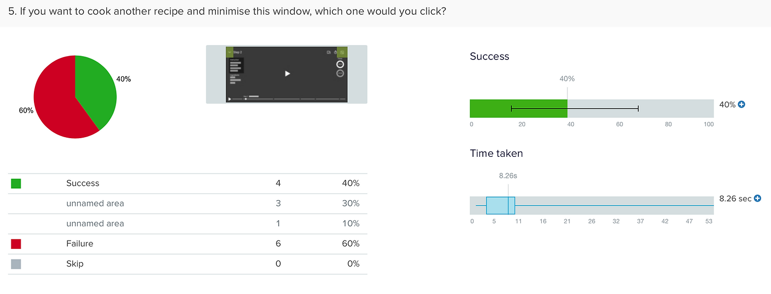
The evaluation for the first click test was mostly positive and showed us that we were on the right path. Most of the tasks were successfully finished, with only one task at 60% failure rate. Compared to the information architecture, people were much more successful at completing the tasks with a visual reference.
The task with the highest failure rate was related to the button placement for minimising the window while cooking. Because there were two possible icons to show a minimising action (one for the tab and one for the cooking steps), users became confused with the meaning of the icons. Subsequently, we replaced the window minimising icon with sometime more commonly used and moved the placement of the dropdown of steps, as to not confuse users.
Conclusions and reflections
At the beginning, we did not intend to set a wakeup word, we wanted the product to continuously listen to the environment while the user was cooking, so the user could interact with the product directly and naturally. However, in the actual scenario after the test with the user, there are a lot of unexpected sound inputs including cooking noises and conversations with other people, so we decided to set the wake-up word.
When using Protopie, we encountered problems with voice wakeup. These problems include, firstly, the inability to set a self-created name when setting the wakeup word. For example, a self-created word "Alexa" will not be recognised because it does not have the word data in its corpus.
Secondly, if the prototype needs to wake up according to the wakeup word, Protopie requires keeping the device on a continuous listener. Due to these problems in prototype making software, we opted for using a trigger button instead of a wake-up word. More specifically, when the button is clicked, it is equivalent to the user speaking the wake-up word. In addition, we replaced the word "pause", a more semantically accurate word, by using the word "stop", a word that is more easily recognised by Protopie. In the second test conducted with the voice prototype, we found that users could use that prototype smoothly and complete the cooking. Our goal was to investigate the use of voice user interfaces for a cooking app and design a functional prototype that could simulate this interaction as smoothly as possible. As a next step, we would have continued to develop the hi-fi prototype, as well as look into development possibilities and alternative tools for VUI’s. Overall, the results of the prototype were positive and worth looking at in more detail for further investigations.
Overall, the project not only highlighted the need for constant and reccurring testing , especially in the early stages of a product, but also the technical challenges in testing a voice activated prototype of any sorts. It was a worthwile journey to better understand products that use this technology and how they could potentially fit into day-to-day activities.
Until next time!